When it comes to designing a room, color is never just a backdrop. It is the silent conductor of the entire space.
As an art teacher, my days are spent watching how people interact with medium and shade. The truth is, color doesn’t mean the exact same thing to everyone.
While a textbook might tell you that red represents passion, to a student or a homeowner looking at a stark red wall, it can easily feel incredibly aggressive and overstimulating. We all carry personal histories and cultural lenses that change how a palette makes us feel.
That being said, there are definitely general associations we observe when color is applied to an interior space. Cool tones like blue and green are universally celebrated for their calming, restorative properties. They make perfect choices for bedrooms or quiet areas where you want the heart rate to drop.
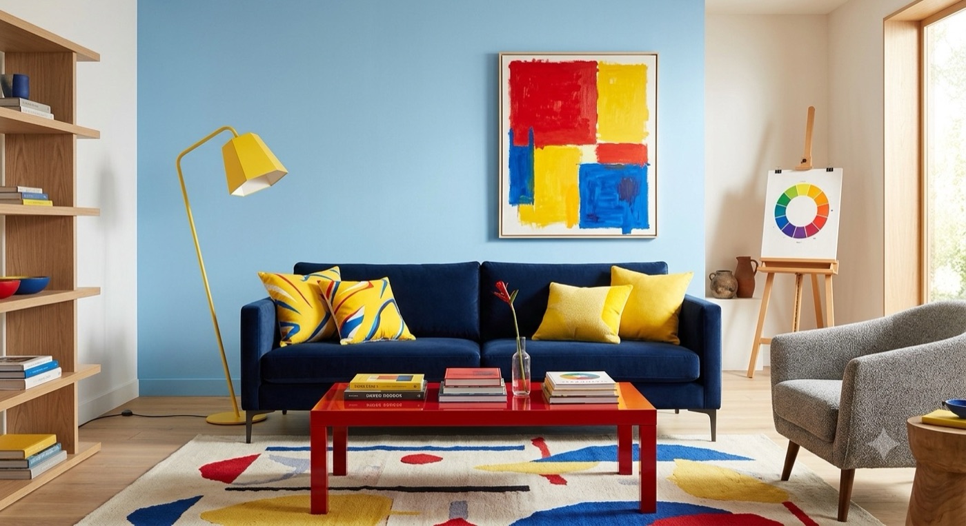
On the opposite end, bright yellow is an absolute jolt of energy. It brings a sense of sunshine, optimism, and cognitive stimulation, though too much of it can cause visual fatigue. Understanding these baselines helps you intentionalize the mood of a room before you even pick up a paintbrush.
To make these colors work harmoniously, we look to classical color combinations that have stood the test of time.
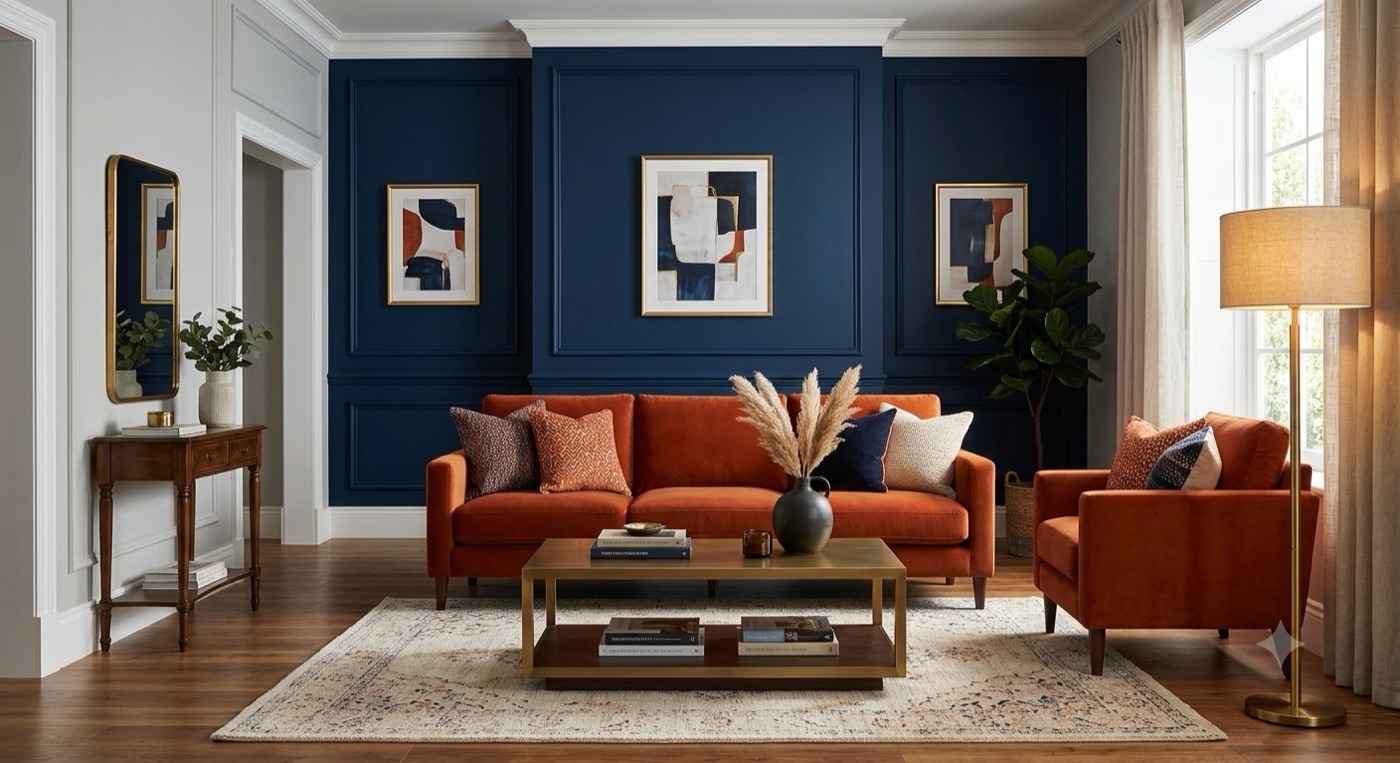
A complementary palette pairs opposites on the color wheel, like a deep navy blue with an earthy burnt orange. This creates a vibrant, high-contrast energy where both colors pop.
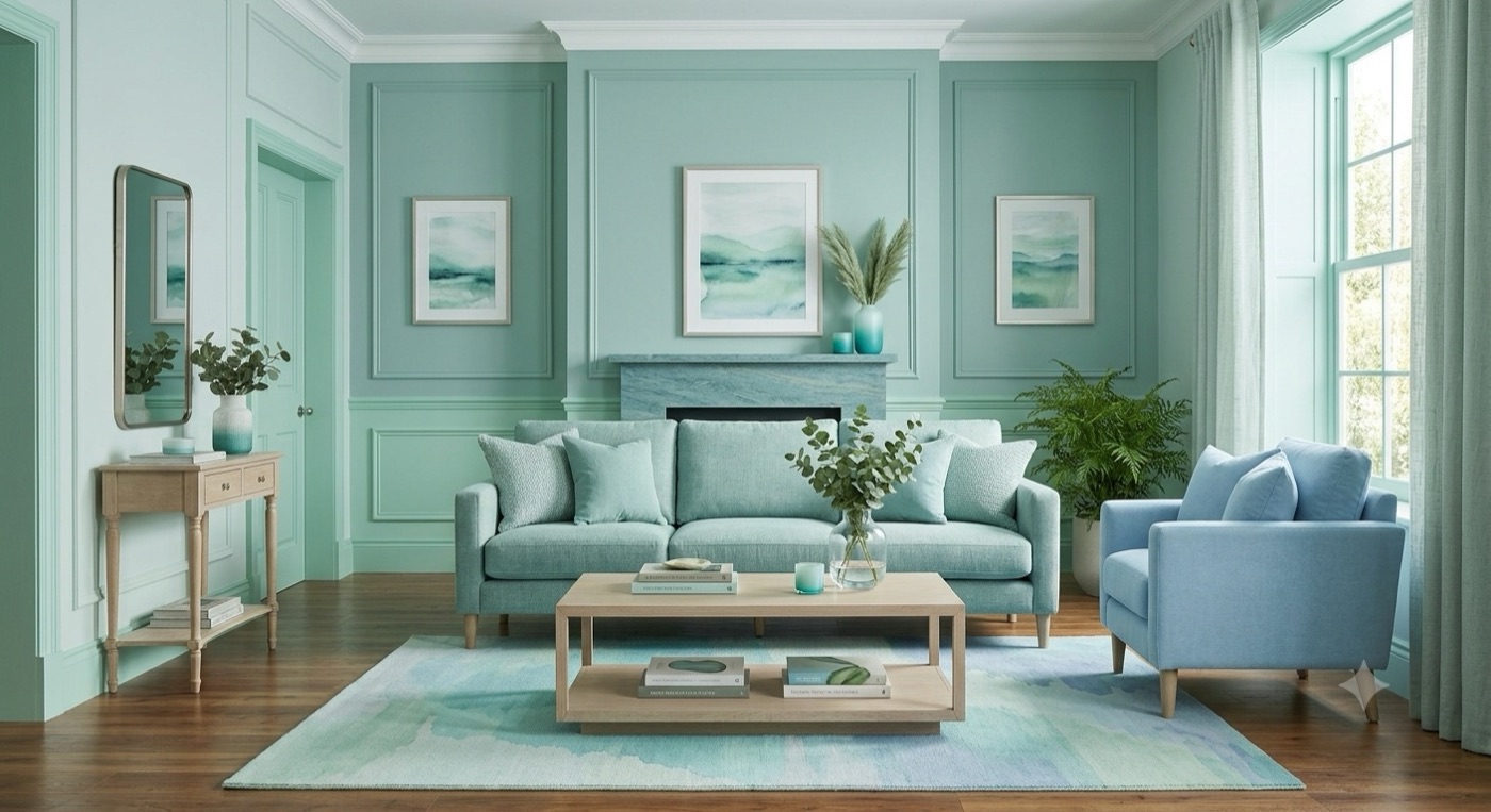
If you want something much more serene, an analogous scheme uses colors that sit right next to each other, like a gradient of soft greens and blues, offering a seamless and organic transition.
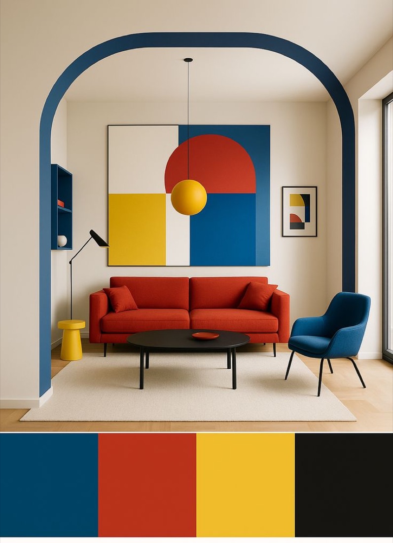
For those who want variety without the chaos, a triad combination uses three evenly spaced colors on the wheel. It balances them carefully so one dominates while the others act as subtle, playful accents throughout the space. You choose. What will it be?